Beautifully Designed Educational Website Designs That Capture Your Attention!
Remember going through college websites just before making a choice and trying to grab all the information possible? Am sure even you agree that the ones with great designs impressed you the most. And that stays valid even today. The design will always be the first aspect of any website that will capture your attention and keep it there. With relevance to this critical aspect, we, in this post, are going to showcase some of the best educational website designs in India.
Website design has evolved from the day of its invention up until today. Although some educational website designs may seem a little outdated, not all college websites have this problem. There are quite a few schools and colleges with beautiful, helpful, and intuitive websites.
Design Is Thinking Made Visual – Saul Bass
And on that note am going to give you a list of some of the best educational website designs in India and also give you some insight on why we think these designs are great!
1. PES University
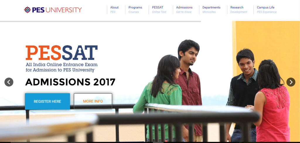 Design: PES University website has a very simple but elegant design with a good choice of colors. A well-organized menu, highlighted events section and ease to navigate are some elements that add to the good design. The website has a detailed footer with segregated information options.
Use of the same font style in different font sizes makes this website look classy and elegant. The text is bold and highlighted in areas that need attention. There is consistency in the colors and font size and styles.
Information: The website has plenty of information for seekers. The Programs and Admissions menu give information to new students about their path of entry into the college. The Departments and Research section has all the information regarding the various branches and streams of education that the University has to offer.
Media Usage: The website doesn’t showcase a lot of media on the Homepage, keeping it simple and light. However, the images on the website are relevant and bright. There aren’t any videos directly embedded on the homepage of the website.
Audience: New students would find it easy to navigate through the website, find all the required details of courses & admissions under ‘Programs’ and ‘Admissions’ to understand all the necessary details of the University. ‘Campus Life’ section in the menu and ‘Upcoming Events’ has information about all the clubs and activities for interested existing students.
The website would succeed to engage Parents of existing and prospective students with all the necessary info about the University, starting from departments to faculty. The footer of the website is neatly organized, this makes searching, fun, and finding, easier.
Features:
- The alignment of elements is good.
- The website has an ‘Upcoming Events’ section with bright images that grabs attention.
- PES University Mobile Responsiveness is great and the website is Mobile-Friendly!
SEOptimer Rating: A+ In SEO, UI/Mobile, and Social
Google Page Speed Rating: 63/100
2. Manipal University
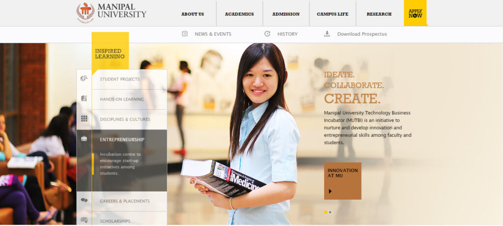
Design: The design of the overall website is unique and neat. Use of flat colors and slides on the homepage make the website very attractive. The website uses a right amount of content and catchy headlines. It’s got an organized and simple hoverable drop-down menu. The website also showcases an extremely informative footer.
Font size and Font Style are chosen well as to keep it simple. The website showcases not more than 3 Font styles and not more than 3 colors, all used very beautifully. The size of the font is perfect and highlights the important sections.
Information: There is a large amount of information provided by the University through the website. Although you can find a detailed menu, not all information is accumulated in a single page. You can find the answer to anything you want to know about the University through this website and finding it isn’t tough.
Media Usage: Manipal University website makes use of a large number of relevant images for every subheading on their homepage. There are no embedded videos and this makes the homepage light and easy to load.
Audience: A helpful website for students, parents and everyone seeking to acquire information about Manipal University. The ‘Admissions’ section in the menu and ‘New To Manipal’ section in the footer has detailed information for all the prospective students. The ‘Academics’ and ‘Campus Life’ are updated with info about the Campus, Student Life, and Learning.
The website overall has a very organized feel and has an added feature ‘Current Student’ to learn everything that they need to and want to learn about the University.
The website also has a downloadable Prospectus and Online Application and Admission. This highlights the fact that Manipal has completely used the opportunity of an online website to benefit its audience.
Features:
- The feature that strikes the eye is the Inspired Learning Slides on which the website structure is built upon.
- There is a unique ‘History’ section with pictures from 1953 and a ‘Quick Facts’ section which a viewer would find very interesting.
- Manipal University website is Mobile-Friendly!
SEOptimer Rating: A+ on SEO and Security
Google Page Speed Rating: 56/100
3. Christ University
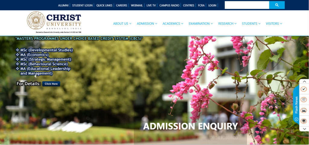
Design: What you will notice first about the Christ University website will be the featured images on the homepage. The website shows the use of bright colors which complements the images as well. The website also uses scroll animations and does a good work with it. The use of a single font style and to-the-point and right content makes this website look simple and neat.
Information: The website makes use of a drop-down menu in which you will find helpful information for all your queries. The footer has 2 main aspects that they have highlighted: Their Vision and Mission. All the information is contained in the header menu. The website also has a floating sidebar for quick links!
Media Usage: As I mentioned earlier the first thing that you would notice would be the beautiful images of the campus used on the website. Although there are no videos embedded, the website has relevant pictures for every section.
Audience: One of the reasons that make Christ University to feature in this list is the special dropdown for Student and Visitors on the Menu. This is a rare feature in most educational websites. The student section covers aspects like Student Welfare, Sports, Scholarships, Examinations and much more that makes the website very useful for students.
On the other hand, the Visitor section has information regarding How to reach the University, ragging, and other extra information. This makes it evident that the website is made to help the audience and make it easy to find what one is looking for.
Features:
- One of the features of the Christ University is the Ovation Section that proudly highlights and encourages the students for their achievements
- A unique feature on this website is the Virtual tour of the University.
- Christy University website is Mobile-Friendly
SEOptimer Rating: A+ in Social and A- in SEO and UI/Mobile
Google Page Speed Rating: 34/100
4. Amity University
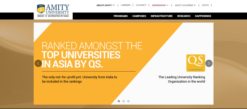
Design: Amity University has a very simple website, without using too many colors, they have managed to bring about a clean look to the website. Like most educational websites, Amity also holds a simple header menu and an informative and organized footer menu.
The website uses multiple font sizes to highlight topics in various sections.
Information: Amity University website is based on facts, the homepage highlights all the numbers and stats. The website has a header menu that covers Programs, Campuses, Infrastructure, Research and Happenings. The drop down menu is available for Programs and Campuses and is detailed and informative. All the information about the ongoing events, updates, and courses can be easily found on the website.
Media Usage: A simple website with no much use of images. There are no embedded videos to make the website heavy. There is a separate section – Photo Gallery for all the media.
Audience: The website, on the whole, is generic to all kinds of visitors. The footer menu narrows down the options to make it easier for a specific kind of audience to navigate to their choice of interest. There are Parents, Recruiters, Student and Alumni Sections zoned separately.
The Recruiter’s section has information about technical and management placements. The alumni section has a login and a notice board for the passed-out students.
One thing that makes this website stand out from the other educational website designs is the ‘Parents’ section, where parents can keep a track of the student’s homework, report card and performance online and prospective parents can talk to the counselors online.
The Student’s section has information for both prospective and existing students.
Features:
- The Amity University website has a 360 Degree Tour and Amity Radio Live which is quite interesting.
- One feature that is different from other educational website designs is that the website features Student, Parent, and Alumni Testimonials,
- Amity University website is Mobile-Friendly
SEOptimer Rating: A+ on Social
Google Page Speed Rating: 57/100
Struggling With WordPress Performance At Scale?
5. American School Of Bombay
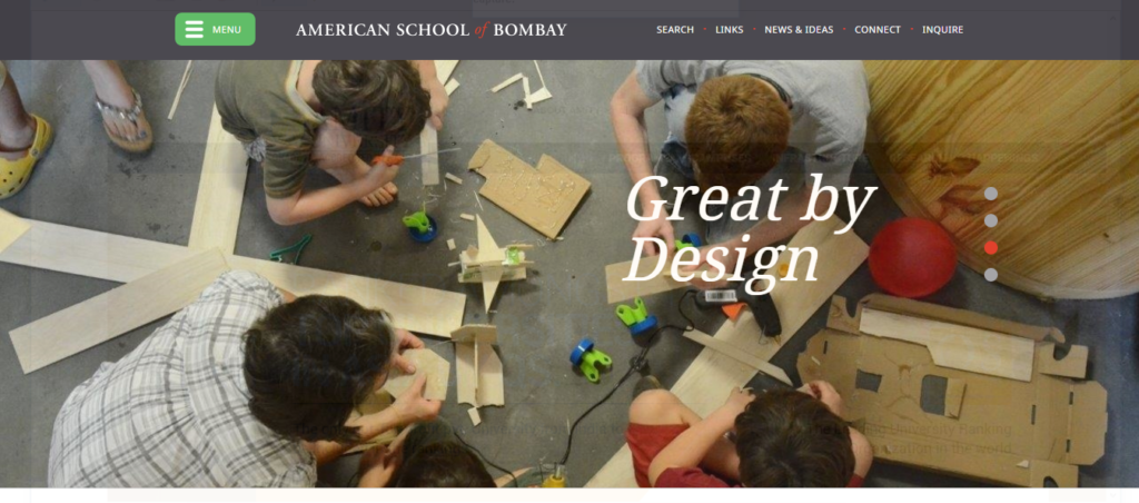
Design: This school website has a lot of images featuring children. They have an informative header menu and a footer menu. Use of a few colors makes the website look simple and easy. The website also uses very little amount of content in the homepage. Also, they have chosen not to stick with more than 3 font sizes or styles which give the website a very simple look.
Information: Information is segregated clearly on the homepage and the menu. They have headlines for every section and makes it easier for school children and their parents to navigate through the site and find the information that they need. ASOB also has an Online Academy making complete use of the online website.
Media Usage: The website uses featured images for every section. There is no other form of media on the website.
Audience: The website focuses on parents and students of the school mainly. Menu section on the website has all the information that a parent would be concerned about like Teachers, Programs, and Learning Support.
The website also has an Inquire Section where one could fill in details and share their concern and queries. News and Ideas section features students, alumni students and events. Also, the Links section in the menu gives all the details of the entire academic calendar, community network and much more.
Features:
- Images featured on the website are of children with catchy headlines.
- American School of Bombay has a Mobile-Friendly website
SEOptimer Rating: A+ on SEO and A- on UI/Mobile
Google Page Speed Rating: 51/100
6. KodaiKanal International School
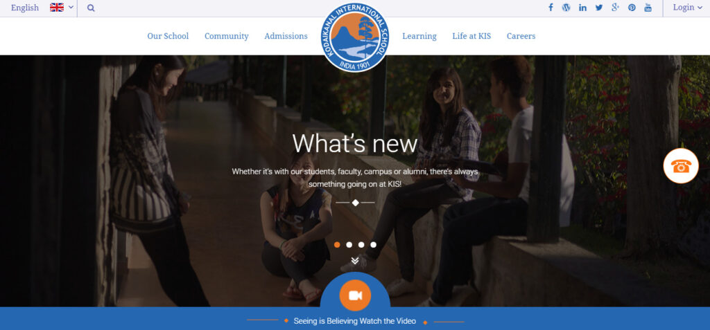 Design: This educational website design uses just 3 colors and makes the website look elegant and beautiful. The header menu is simple and has a detailed drop down menu. The features of the school are highlighted as you scroll down the homepage in a creative way.
Font colors are consistent and the headings are highlighted. The font style used is consistent throughout the entire website and gives a professional look it.
Information: The header menu has a separate drop down lists for every section. The admissions and learning section offer information about all the programs the school has to offer. The content on the homepage is nicely written and gives brief information about the sections. The footer menu has FAQ sections that answer a lot of visitor queries.
Media Usage: The website uses pictures from the school campus, clear and bright images that manage to capture the attention of the viewer. The icons used are simple yet relevant. There are no videos embedded into the homepage.
Audience: Kodaikanal International School website has a Community section in the menu for students. This section has all information about the KIS staff, parents, alumni, and council. The Admissions section has all information needed for a prospective student and parent related to Fees, Scholarship and student support.
The Learning section under the header menu has detailed information for students regarding all the courses that the school has to offer. There is a special section for the Alumni Students of the school. They also have a parent and alumni login option.
Features:
- One feature that is different from rest of the educational website designs is the ‘Fill up form’ on the homepage.
- KIS is Mobile-Friendly!
SEOptimer Rating: A+ in Social and A- in Security and SEO
Google Page Speed Rating: 73/100 – Highest in the list
7. Woodstock School
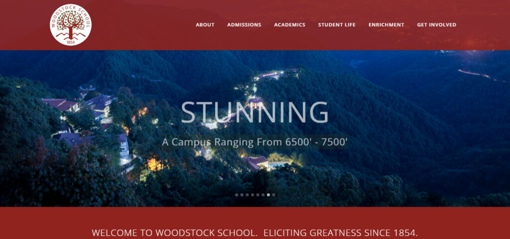
Design: This school website has a unique and professional touch to it. It has a hover over drop down menu for each of the sections of the header menu. The website doesn’t have a lot of content, the images speak for themselves. The footer menu is different and interesting.
The Font style used is consistent throughout the entire website which adds to the professional touch. The entire website consists of 3 flat colors.
Information: Information is available on the header menu under each section. The header menu has sections that include Admissions, Academics, Student life, Enrichment and more. The website also had information in videos and tweets! It also succeeds to highlight all the features of the school throughout the entire website.
Media Usage: The website not only uses high definition images but also has embedded Youtube videos and tweets. Social media channels are also associated on the homepage.
Audience: The Admission and Academics sections provide all the information for prospective parents and students. The special section Student Life on the menu gives info regarding residential, religious and counseling for the existing students. The About section has information for the Alumni students and faculty.
For everyone else, the website has answers to all their queries in the header and footer menus as well as the homepage.
Features:
- Section with the headline: Number of Km traveled per semester that encourages a different schooling experience
- The website has a section called Quick Links in the footer menu and also a Blog!
- Woodstock School website is Mobile-Friendly
SEOptimer Rating: A+ in Social and A- in SEO and Security
Google Page Speed Rating: 72/100
Subscribe to our newsletter and write to us if you want us to analyze the plus points of your educational website designs!

Obviously it will be so effective guideline for make best website in here. Every educators are also enjoy this lesson from you. I hope they have more talent to work with this.