The Differences Between Web and Print Design you need to know.
 Design
|
Design
|  6 minutes
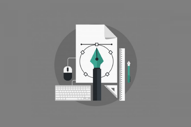
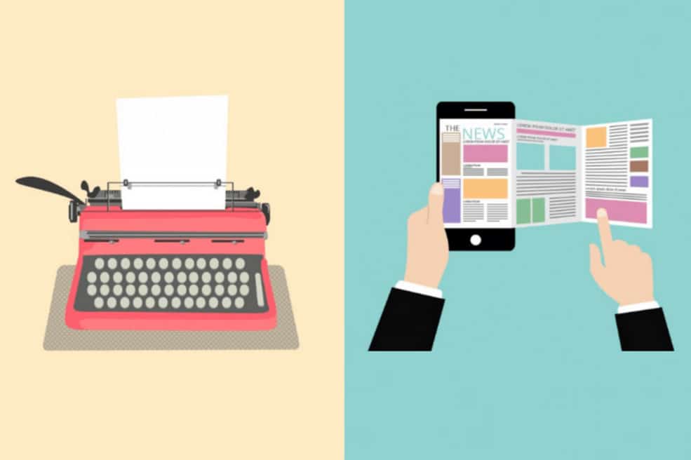
Both print and web are powerful mediums that have the power to persuade. If you want to create a website soon, and are thinking about how different web is from the print world, you’ve come to the right place. I will explain in detail about both web and print design, and how different they are from each other.
Web and print design- User experience
In print, navigation consists of page-turning, a simple user interface. In print medium, the design is entirely made in canvas, with the user walking through information from page to page.
In web design, users scroll through scores of information, and have the ability to jump to content which appeals to them first, rather than going through a linear way.
Also, print design offers one-way communication with the user, while the web has ability to allow two-way communication with readers.
In print, the user is able to physically view and feel the printed material, interacting with it directly. In web, the user views the content through a screen.
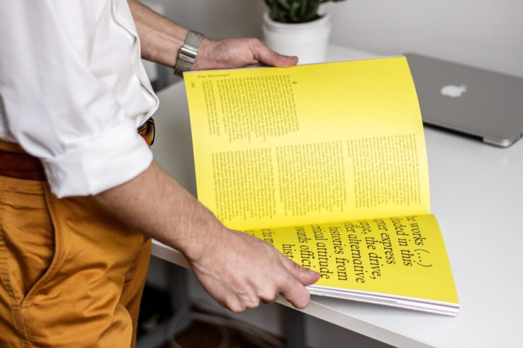
To engage user’s senses and interest, print design may include experiences such as adding texture, shape, or printing effects like letterpress, embossing, varnishing, lamination and so on.
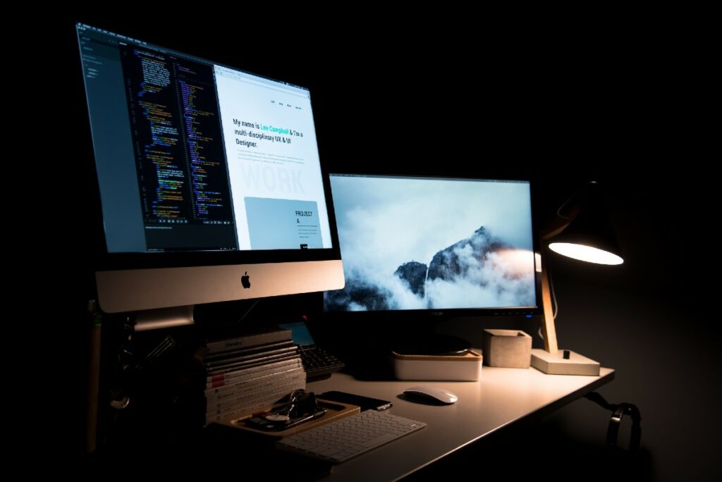
Web design, on the other hand may include interactive elements such as animation, mouse-over effects, hyperlinking, instant messaging and so on, along with audio and video.
For example, a printed brochure might have a nice printing effect such as embossing, and its content might be neatly packed into blocks with attractive images picking user’s interest. The brochure might have a certain feel to its paper, with users appreciating the rustle and the smell of the paper.
A web brochure on the other hand, might have animated illustrations that might be helpful to users, along with hyperlinks that link readers with additional information about its content.
Both print and web design have their own separate appeal and advantages.
Size
In print, the reader is able to physically view the print material, and so the designer must take into account the size, weight, and materials, before going into the creative stage.
The content produced during the creative stage will be included into the canvas according to the measurements that were pre-set.
As print has a fixed size, you can work on the canvas provided to you with pre-given measurements, working around the edges.
The design for web is fluid, as the edges and measurements for the web screens change according to browsers, and mobile platforms. The same website for instance would look different on a desktop than its mobile version, with the content aligned differently.
The designer may establish the font size, colors, background image, spacing etc., which is then applied to the content produced.
The alignment of content in a website layout would change, as content is updated and added by the designer. In this way, websites keep changing according to the expansion and reduction of content on a daily basis.
Due to the inflexibility with printing, one can determine with absolute certainty how the user is going to view and interact with the printed design.
However, due to the variations in screen sizes and resolutions on the web, the end result cannot be predicted accurately.
The designer will have to add in the flexibility of adjusting to different screen sizes in order to produce the best results for all users. In this way, web and print design differ acording to size.
Typography
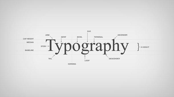
Image Credit- www.jamesportis.com
The types of fonts available to pint designer sare almost unlimited, as there’s an array of fonts available on print designing tools such as InDesign and Corel Draw.
The fonts can be used as is, as the designer knows the final outcome of the design. In web, however, web fonts are required to be used, ones that are simpler than print fonts and which have increased legibility.
Readers will be undergoing fatigue while viewing websites on screens, and so, the fonts must be easier to understand at first glance. The text has to be accurately spaced for viewing on screens, so that not much strain is put on the eyes of the reader.
Even now that you are reading this blog post, you can see how the text is divided into short paragraphs of few lines, with optimum spacing between each paragraph and image.
On the web, the reader has scores of data to digest and various distractions to go through.
There are also various web fonts directories available, such as Google Fonts and Adobe Edge Web Fonts, that make web fonts easily available to web designers.
For both web and print design, factors such as kerning, tracking, leading and ascender and descender heights must be taken into account.
Kerning provides adjustment to spacing between pairs of alphabets, while tracking or letter-spacing provides adjustment to spacing of a word or block of text.
Struggling With WordPress Performance At Scale?
Color
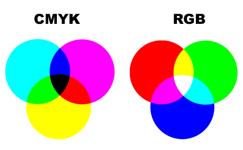
In print design, designers use CMYK, the ink colors Cyan, Magenta, Yellow and Black. Individual colors are formed from mixing percentages of the above four colors, in print.
Colors then have codes, that signify the base colors that produce the given color. This is based on subtractive addition of color, by combining all colors you get black.
Screen and lighting technology is based on RGB, which is the colors Red Green and Blue.
The various colours are encoded as a value of 0-255 for each of the three colours, and works in an additive manner. When all the 3 values are maxed out at 255, the color displayed will be white.
Due to the differences in how the color is handled between screen and print, there is a need for calibration between the screen and printer to produce the most accurate print.
While on screen, a picture might appear dull or bland, this might be because the screen itself is off on the color calibration.
The color displayed on screen might not be the same color present when the picture is printed due to the mismatch in calibration.
For professional photo and video editing, a screen with accurate calibration is therefore required. Apple’s screens for their Mac lineup is particularly known for their high color accuracy.
Resolution
In the actual printing process, DPI (dots per inch) comes into play, and equipment that prints at a higher DPI will produce a higher resolution image.
PPI (pixels per inch) refer to the number of pixels present per inch of screen space, and on web, the general acceptable PPI value for images is approximately 72 PPI.
PPI is responsible for the quality of the image, and by extension, the size it can be scaled to. DPI has no relevance for web design, as it signifies how ink is printed, and is also not responsible for the size of an image.
PPI on the other hand, has an inverse relationship with the print size. Higher the size of the print, less is the PPI and vice versa.
Is there an important point that we missed out? Feel free to comment your suggestions below!
Follow us on Facebook, and don’t forget to check out our previous blogpost over here!
 March 4, 2021
 Design
 E-Commerce
Your article make me inspire give me more idea. Thanks for sharing your great information. Good day!!
There has lots of differences between this print design and web design where as the web design is the toughest one.