
Mobile Friendly Website Will Rank Higher From April 21st.
 SEO
|
SEO
|  7 minutes
“Starting April 21, we will be expanding our use of mobile-friendliness as a ranking signal. This change will affect mobile searches in all languages worldwide and will have a significant impact in our search results. Consequently, users will find it easier to get relevant, high quality search results that are optimized for their devices.” – Google Webmaster
Google has made many changes to its algorithm in the past. Some have ended up burying popular sites because they didn’t meet the new requirements. This time Google has announced that it will consider a mobile friendly website as a positive ranking factor. There are still millions of websites out there which have not adopted the responsive design concept.
The big question for you as a business owner: Is yours a mobile friendly website? Find out with this simple test.
So what is a mobile friendly website?
A website that can be easily viewed, read and interacted with on mobile devices and provide the user with information that is not restricted to only on desktop computers.
It can be frustrating when you open a website on your mobile and have to constantly zoom in it to read the contents. The desktop version of the website, by nature of its design makes it a sub-optimal reading experience on your mobile device. When website visitors can read and interact with a website across multiple devices without experiencing issues, it provides an ideal and consistent experience.

The use of a separate mobile website adds to duplication of content, confusing URLs and two different websites to maintain for the business. A ‘responsive website’ aka mobile friendly website, on the other hand is one single website that automatically adapts to the size of the screen it is being viewed on.
Unless you’ve been cast away on a remote island for the last few years, you will have noticed the dramatic rise of mobile devices and the changing social behaviors with it.
77% of the mobile device usage happens at home or the workplace. This is interesting because, both these locations are most likely to have a desktop computer around. The convenience of using a mobile device to quickly browse through and share matter is what is driving this usage.

How does your mobile friendly website help Google?
1. Single URL:
Having just one HTML code and the CSS taking care of the screen dimensions, reduces the complexity of managing multiple code bases and duplicate pages of content.
2. Google algorithms can accurately index
Google needs to accurately index your website’s pages. If web pages can’t be viewed on a mobile, the server will throw an error page or redirect to another page. It becomes difficult for Google to then parse the details necessary for it to index.
3. Less time to develop
With just one website to develop and maintain, it significantly reduces your development time and cost. With two different websites, you will need to maintain a tight versioning system to ensure both websites reflect the same content.
4. Reduce chance of errors
Some of them include blocked CSS, Javascript and image files, unplayable content and mobile-only 404s.
5. Reduction in loading time
If you had only a desktop version of the website or had two separate versions of your websites (not a responsive website like explained earlier), every time a web page was accessed, depending on its availability, there would be redirections involved from one website to another. This adds to load time.
Studies show that users will not wait if the website takes beyond a few seconds to load.
6. Help Google to crawl your website faster
Instead of having many google bot user agents crawling through all the content of various devices, we can now have just one crawling the page once. This way the google index improves for your website.
For these above reasons, Google will crawl, index and rank your pages higher if you have a mobile friendly website.
Struggling With WordPress Performance At Scale?
What you need to know before getting a mobile friendly website?
Understand your user demographics and their mobile usage. This will allow you to make specific adjustments to cater to their needs when accessing the information through a mobile friendly website.
While ranking higher on Google’s search results is a big incentive, the main objective for you should be to do the following:
1. Making it easier for the customers to access information across all types of devices
2. Consistent user experience no matter how the user accesses your information.
Google compares the layout, content and speed of a website as the three legs of the tripod. Ignore one leg, it becomes weak and your website will fall down. We’ve written about this previously on the importance of content in website planning.
“Best way to engage and keep your users is to make sure all three legs of this tripod are sturdy”
Layout – On a desktop you could have as many as 3 to 4 columns of content and yet maintain a decent standard of readability. If you were to squeeze four columns of content on a mobile phone, the user would have to pinch and zoom many times to be able to read the content. On a mobile friendly website, the columns would most likely shift one below the other. Disable popups on mobile layouts if required, as they might obstruct content.
Content – You need not reduce the content, instead customize it well for the mobile screen. Choosing appropriate layouts can help. When designing the website, start with the content and then design for the smallest screen first. You can then proceed to larger screens. If there is a use case for not showing all the content on your mobile website, you can hide that information.
Speed – Mobile bandwidth is generally lower, so heavy content can add to loading times. Apart from the speed of loading your website, be sure to check the image and file overload. Optimizing media files and choosing mobile compatible media can speed up your mobile friendly website.
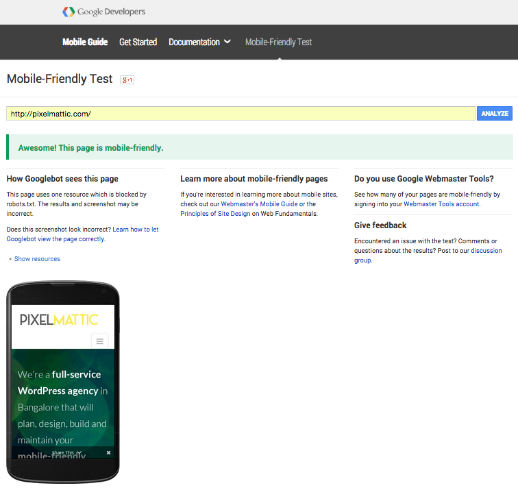
Testing – It is important that you check the website is meeting all your objectives of consistent user experience and information accessibility. With the proliferation of so many devices, it can be a challenging task to ensure the mobile friendly website is true to its word. There are simulation tools that are available that can help you with this task.
Google’s own mobile friendly website test is a great starting point. You can also get a more detailed report of errors if there are any, on Google’s Webmaster Tool. Apart from telling us whether the website is mobile-friendly or not, Google also lets us know if there are pages that the googlebots are not able to crawl.
Websites that pass this test will obviously be ranked higher to all those that get a ‘Not mobile-friendly’ report on them.
Want help with building a mobile friendly website?
[content_band inner_container=”true” no_margin=”true” padding_top=”0px” padding_bottom=”0px” border=”none” bg_color=”#bababa”]
Error: Contact form not found.
[/content_band]
A few examples of mobile friendly websites we’ve done in the recent past:
Resources for building a mobile friendly website
1.Google’s whitepaper on developing a multi-screen website for consumers: Download here
2. Google on Mobile SEO: Read here
3. Cisco’s mobile data traffic forecast 2014-2019: Download here

 April 27, 2026
 SEO
SEO