Choosing a mobile-friendly WordPress theme goes a long way in ensuring your website is viewable to smaller screens.
According to TechJury, Mobile market share worldwide is 52.1% compared to the desktop market share of 44.2%. Moreover, mobile market share has been steadily eating into the desktop share over the last few years. Hence it’s only logical that your website is optimized for mobile devices.
In March 2020, Google officially announced that they have been working on mobile-first indexing. What this essentially means is that Google will be doing most of its crawling with their mobile smartphone user agent.
What is Website Mobile Optimization?
In simple terms, mobile optimization is the process of ensuring your website works and looks fine across mobile devices. This includes ensuring all functionalities work fine in addition to content formatting being in place. You can take this one step ahead and have some functions exclusive to your mobile site.
“To improve site performance, the number one technical SEO tactic used by marketers is optimizing mobile performance.”
Hubspot report, November 2019
There are a ton of mobile phones and tablets in the market today. Ensuring your website is optimized for everything can be a mammoth task. However, there are a few different types of tools that you can use to make this process simpler.
Free Tools
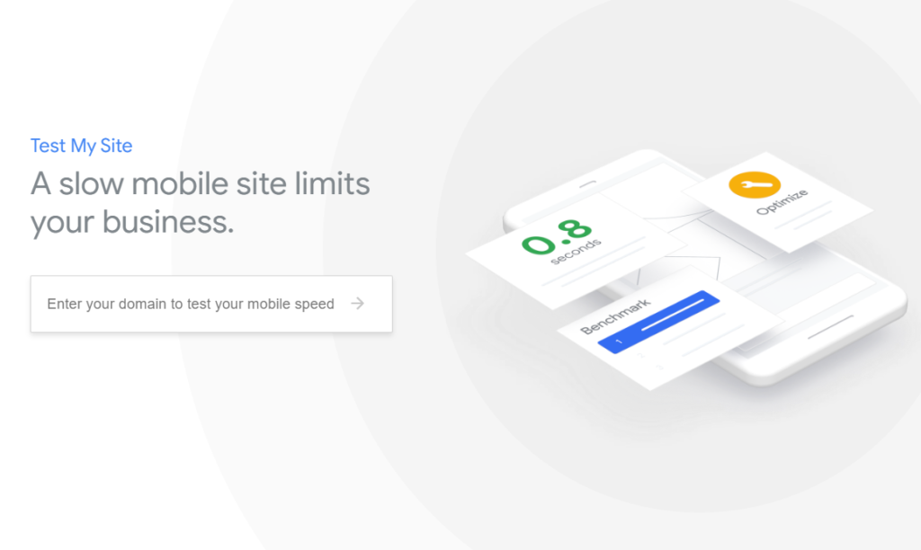
Google has a pretty simple tool to test the speed of your mobile speed. You can check it out here:
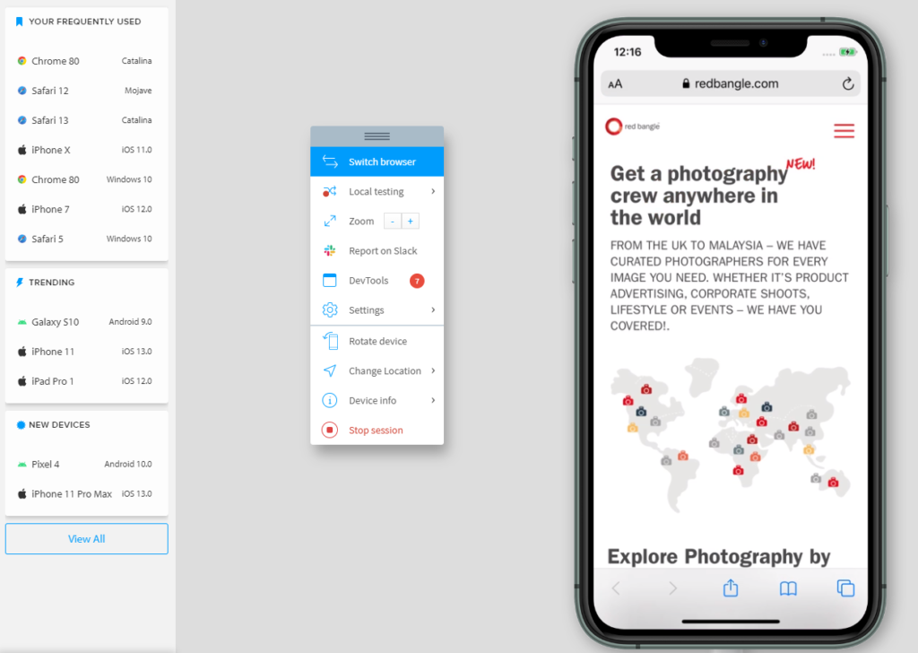
There are also several free tools to simulate what your mobile website will look like on different devices. IPhoney, MobileTest.me, and Google Chrome Dev Tools are a few of the free tools available. However, free tools have their limitations. They can be time-consuming, and you will need to test each page manually. This process can result in some errors being overlooked.
Paid Tools
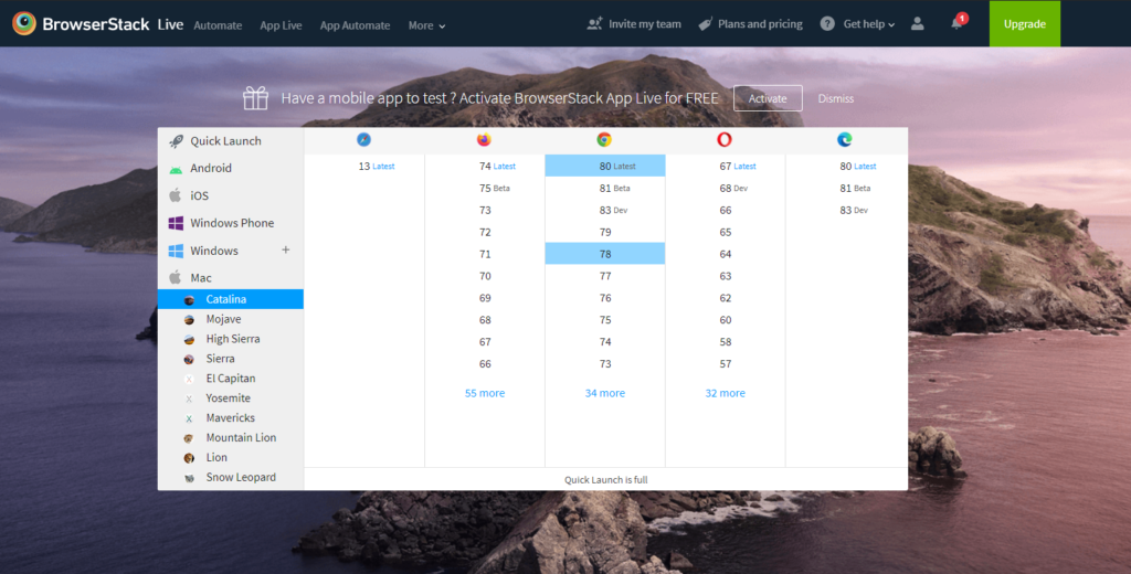
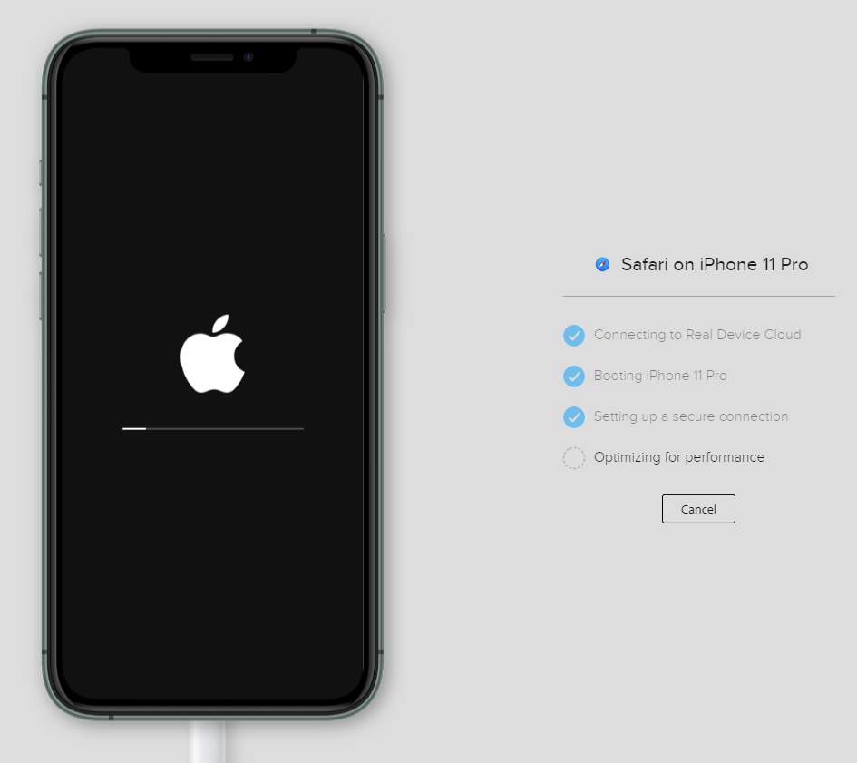
Page-oscope, Browser Stack, and Sauce Labs are some of the popular paid tools in the market. Tools like Browser Stack even allow you to log on and test on actual devices as well.
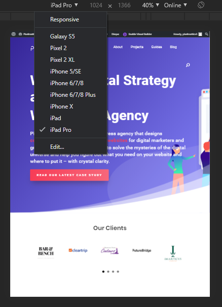
But the simplest of all tools is free of cost, and available right within your Chrome browser.
Ctrl + Shift + I will open Chrome Inspect element which will let you simulate the website for different screen sizes. While occasionally there might be differences between the simulator and a real device (that’s why we use BrowserStack as well), for most scenarios this is a quick and easy tool to check your website’s responsiveness.
How to Create a Mobile-Friendly WordPress Website
You are faced with one of the two scenarios – an old website that needs to be optimized for mobile or you want to build a new mobile-friendly WordPress website.
1. Optimizing an old website: This is the more challenging of the two scenarios. Remodelling a house is more difficult than building a new one. However, for starters, you can first assess the list of mobile issues to understand the scope of work.
You could use WordPress mobile plugins to add a mobile-friendly menu which is the most common problem on old websites.
WPtouch promises a quick way to convert your desktop only website into a mobile-friendly WordPress website in a few clicks. It adds a separate mobile view without disturbing your desktop website to render content on mobile devices. As with most things, your mileage may vary depending on how your website has been set up.
If none of these plugins helps, then your next option is to hire a WordPress agency to assess the website and provide you with a custom solution.
A mobile-friendly website is also referred to as a Responsive Website. In the early days of the mobile era, companies would run two versions of the website – one for desktop and another one created specifically for the mobile. Today, the word responsiveness means, the same website adapts automatically to the width of the screen and renders the content accordingly. A responsive website is easier to manage as it’s a singe entity with one codebase. However, there are still use cases for building mobile only websites.
2. Building a new mobile-friendly WordPress website
This is far easier to do than trying to optimize an old website. Picking a mobile-friendly WordPress theme is a good first step. If you follow our recommendations from the chapter on WordPress themes, then a lot of your mobile concerns will be addressed.
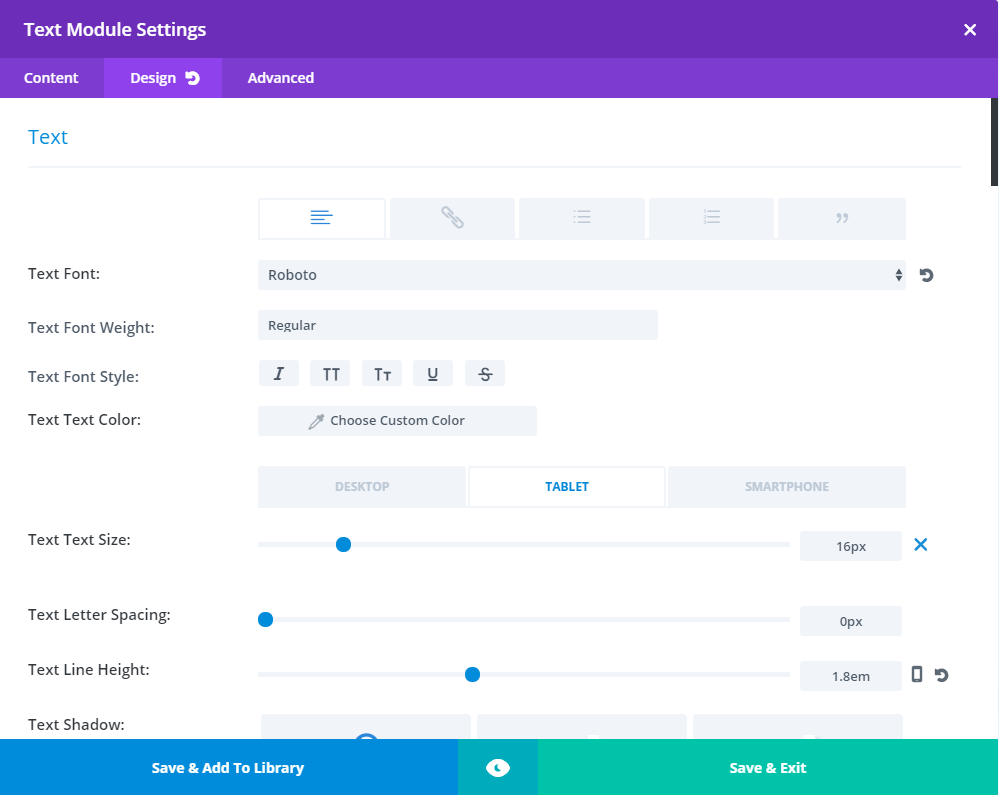
In addition to using a responsive WordPress theme, you can take advantage of WordPress page builders like Divi, which provide you with the options of tweaking your content presentation on mobile.
In Divi, you can set different font sizes for desktop, tablet and mobile.
You can also decide to show or hide a specific section of a page on mobile devices.
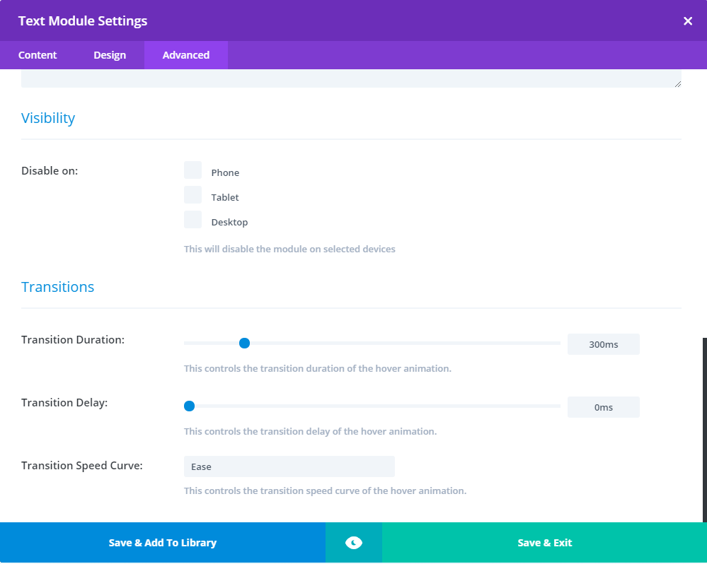
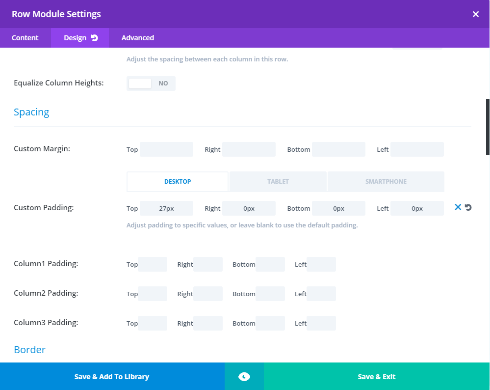
If you need to tweak the spacing or padding of some sections, you can set that manually for desktop, tablet and mobile in Divi’s Row Module Settings.
Tip: When you are testing websites for responsiveness while the development or fixes are going on, make sure to clear your cache regularly. Otherwise, you will not see the updated changes and will lead to unnecessary back and forth between you and the developer.
If you’re looking to build a mobile-friendly WordPress website, set up a 30-minute consultation call with us today!
A Case Study
A retail software company revamped their website to reflect their new branding. Soon after going live, they invited their long term customers to give them feedback about the new website. Unfortunately, they started receiving comments that the site was not optimized well for different mobile devices. Though they had used a few free to simulate how the site would look on different devices, some errors had slipped through the cracks.
The drawback of free tools is that it is extremely time-consuming. Something which most companies tend to gloss over and go live. To fix the issue, they approached an agency that used a paid tool to do a more thorough optimization. Soon they were able to sort out all issues.
How Do You Decide Between a Mobile-Friendly Website and a Native Mobile App?
If your requirement involves making use of any of the following features, then you must consider a native mobile app:
- Budget – Mobile apps are generally more expensive to build
- Location – Do you need access to the user’s current location
- Real-time information – Do you need to provide real-time information like notifications?
- Mobile USP – Does the mobile form factor suit the context in which the user needs your information?
- Phone sensors – Will you make use of the sensors on the phone?
- Usage frequency – How often will the user access your information or service?
- Offline access – Do you need to allow users to consume content when they’re offline
Progressive Web App (PWA) – The Best of Both Worlds?
Building a mobile app can be an expensive exercise. The apps can also get lost in the marketplace amidst the 1000’s of options. Getting users to download and install your is one challenge, but getting them to frequently use it is another.
A PWA works through your browser but benefits from the latest evolution in technology to provide an app-like experience. It loads instantly like an app unlike a website and provides better discoverability through search. You can even install it on your mobile and open the site instantly.
A mobile-friendly WordPress website can be converted into a Progressive Web App using a WordPress plugin or rewriting the entire website.
Here are a few plugin options:
Turn your WordPress website into a Mobile App
If you decide mobile app is the option for you, but are hesitating to invest in designing and developing a native app, then this is a quick way to test the waters.
There are mobile app generators which plug into your WordPress CMS, fetch the content and deliver it through a native app. Here are some of the best WordPress plugins for this:
Disclaimer: Some of the links in this chapter are affiliate links. We will earn a commission if you click through and make a purchase of any of the services, at no additional cost to you.